Original URL: http://www.agry.purdue.edu/ext/corn/research/psv/Update2004.html
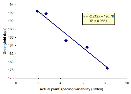
This scatterplot shows the relationship between how close together corn plants are seeded in a field and the resulting yields of that field. A lot of science goes in to large-scale agriculture.
No comments:
Post a Comment